Branding basics for your small business
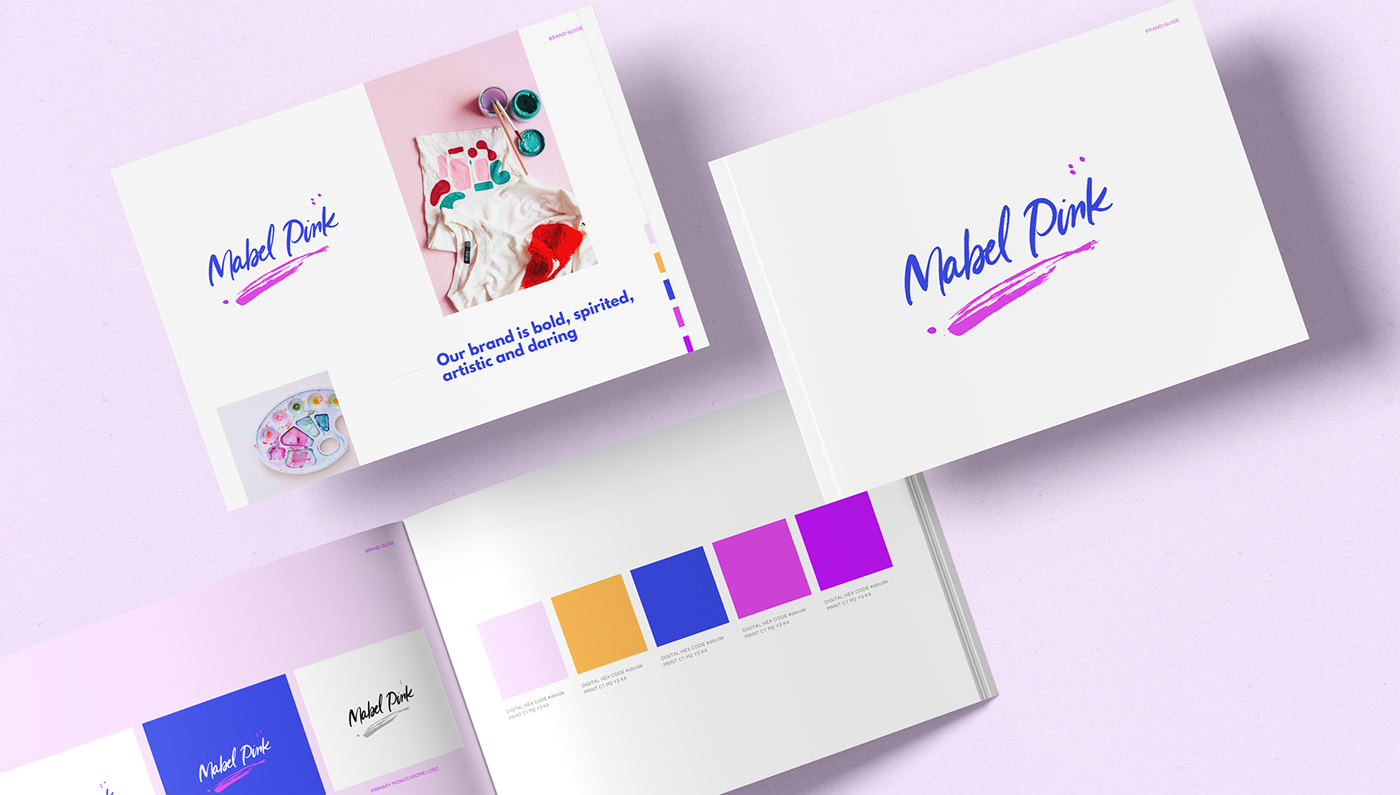
Let’s break down branding basics so you can walk away with a really great understanding for how and why its super important for your small business!
The truth is, I’ve got my finger on the pulse when it comes to branding. I’ve had more than a decade of experience in creative roles, studied contemporary art and studio photography and hold a Bachelor’s Degree in Communication Design to top things off. #humblebrag.
What I’ve learnt first hand is that brands that have been through the process of having branding guidelines created from a strategic perspective are so much more aligned with who they are, who they serve and how they want the world to see them.
Hopefully, you can walk away from reading this article with a great understanding of how a branding guideline will help your small business flourish.
Firstly, what are branding basics
(also known as brand guidelines)?
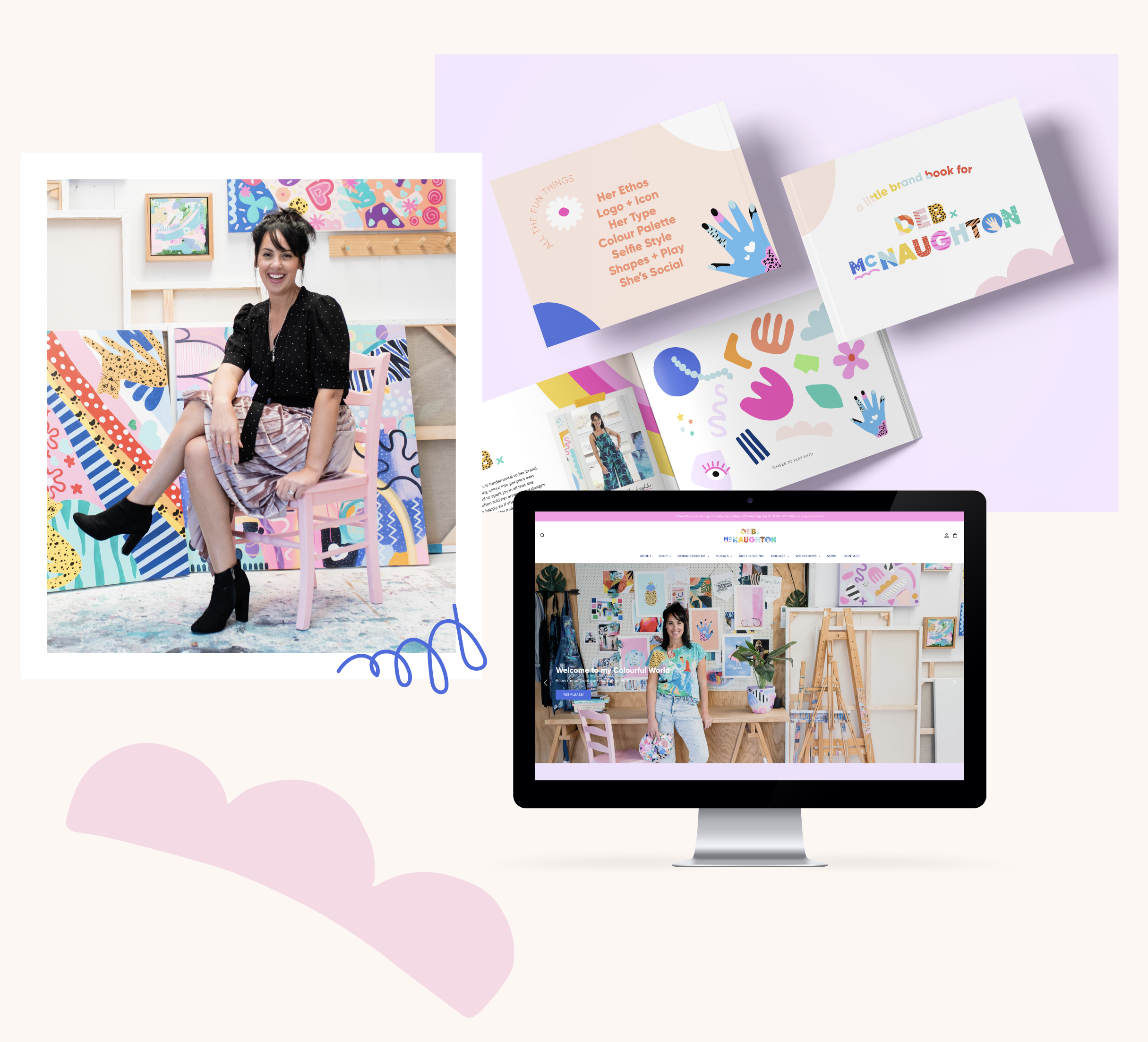
Visual branding is every single visual touchpoint of your company or business. It’s made up of many strategically designed elements. Every element, then speaks to each other to make up a visual language – they all pair seamlessly in harmony to emanate your brand’s values and how you want your customer or client to feel or experience.
Your visual branding does the talking for you when you are out of the room and the more consistent it is, the longer-lasting impression it makes.
The Brand Playbook service I offer is an in-depth process of getting to know you, your why, who your customer is and the personality of your branding. You can have a looksee at my process here
My Brand Playbook is a 30 page, one-of-a-kind brand guideline booklet that encompasses all of your brand’s visuals. This includes:
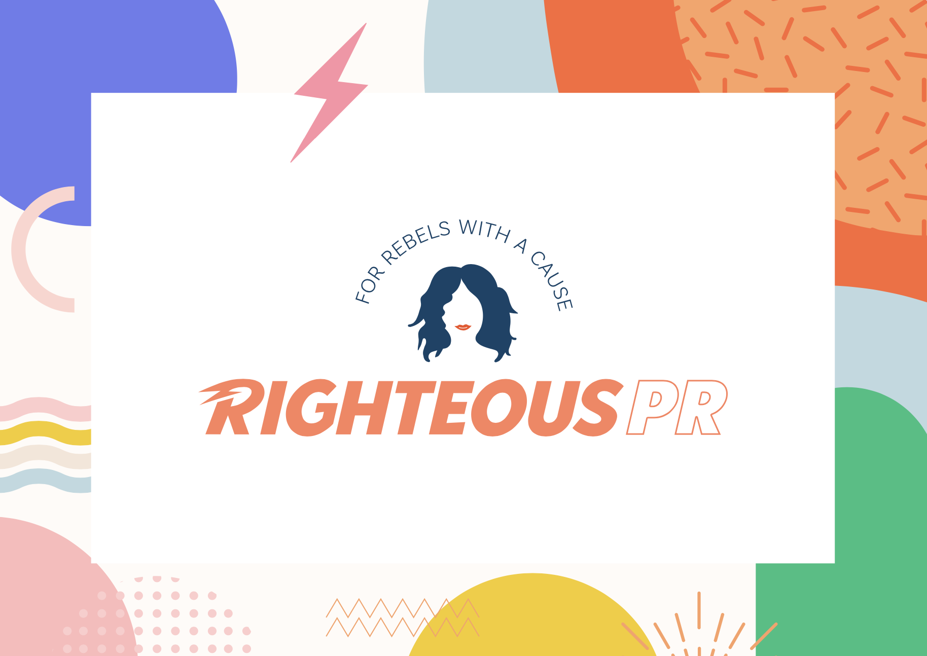
Brandmark/Logo
Primary, secondary, monochrome, reversed, stacked, icons, favicon – there are many different versions and most important is knowing how to use them and how not to use them! Guidelines are the key here.
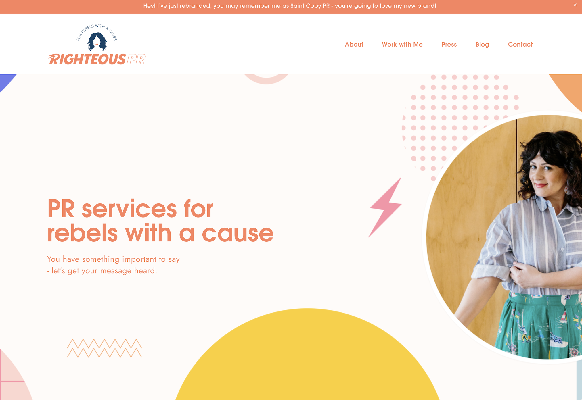
Brand Typography
Generally you should have a headline font (which would have more personality)- and then a body copy font – which is the paragraph text on your website for example – and this should have a strong focus on legibility; meaning it’s easy to read.
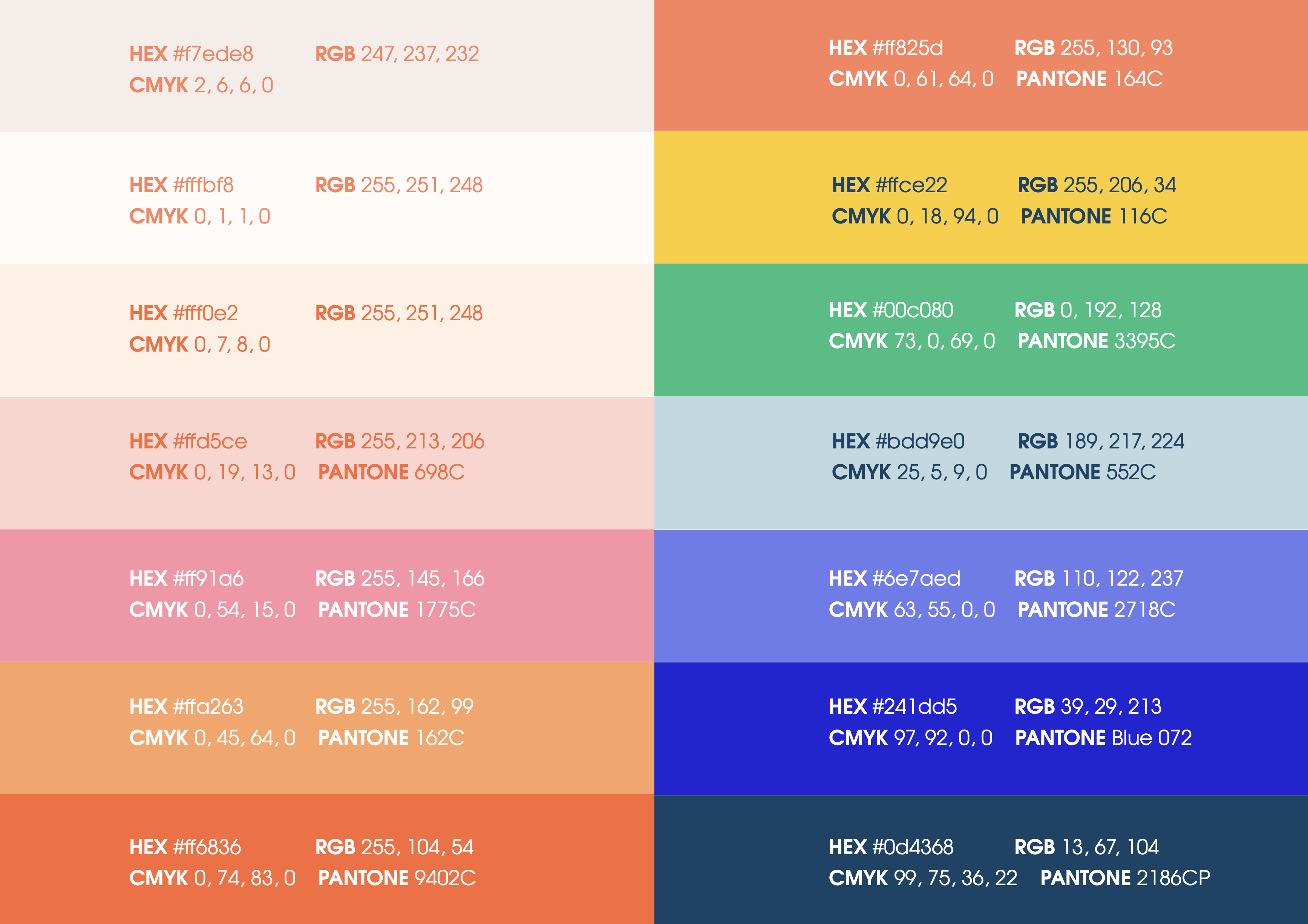
Brand Colour Palette
Every brand needs hero colours and secondary colours to compliment and is tailored to your target audience. Think about how your ideal customer feels when they come to you, do they need you to be soft and caring? Or do they want to feel excited/energised? When you’ve chosen your colours you’ll need to get the hex colour codes for digital and CMYK and Pantones for print usage.
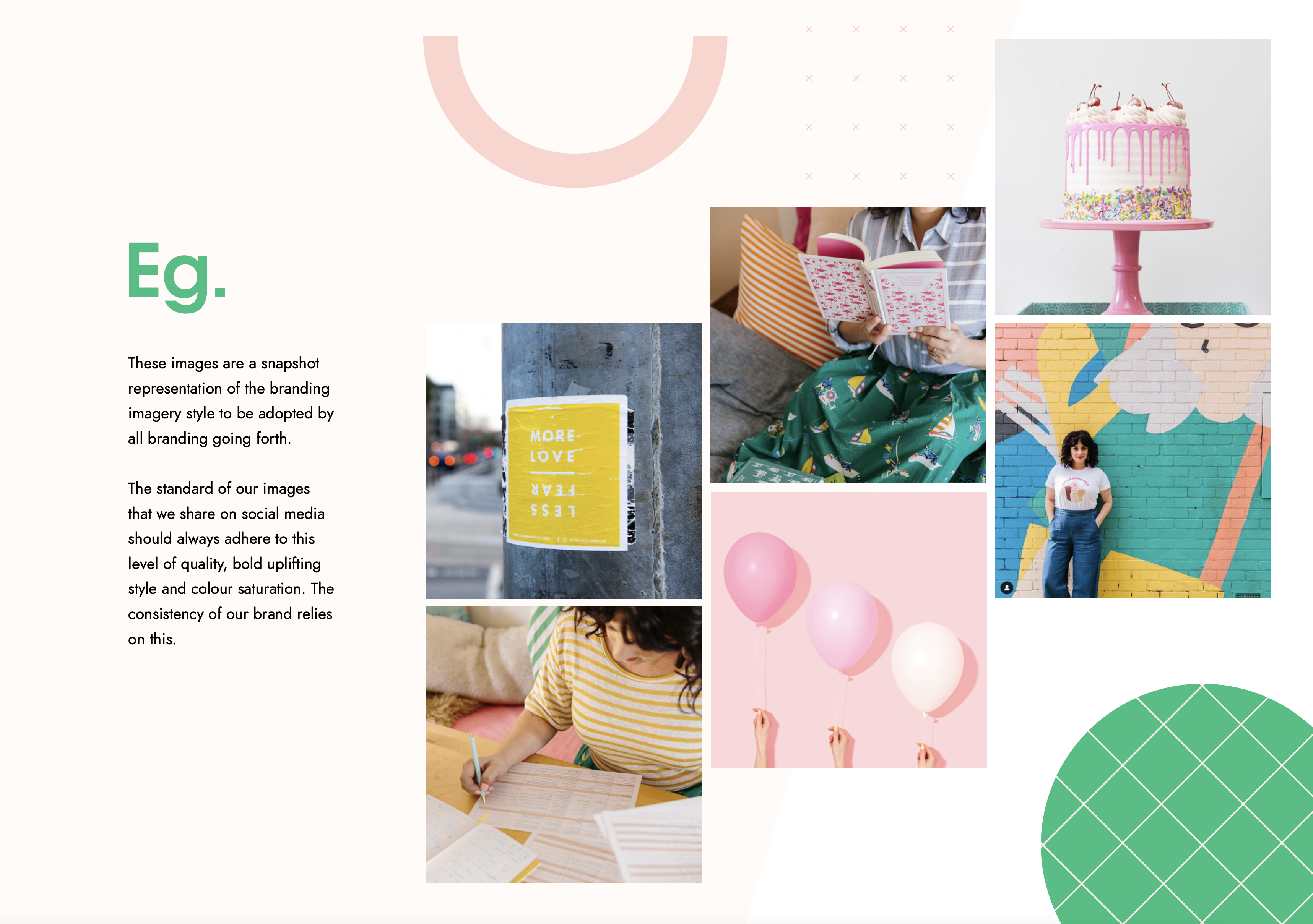
Brand Imagery
Example imagery – usually this is stock photography to represent the style of your brand. Unsplash or Pexels are great for this. I can’t recommend getting professional branded photography enough and guess what? I know some amazing photographers that do just this.
Check out my photographers list here.
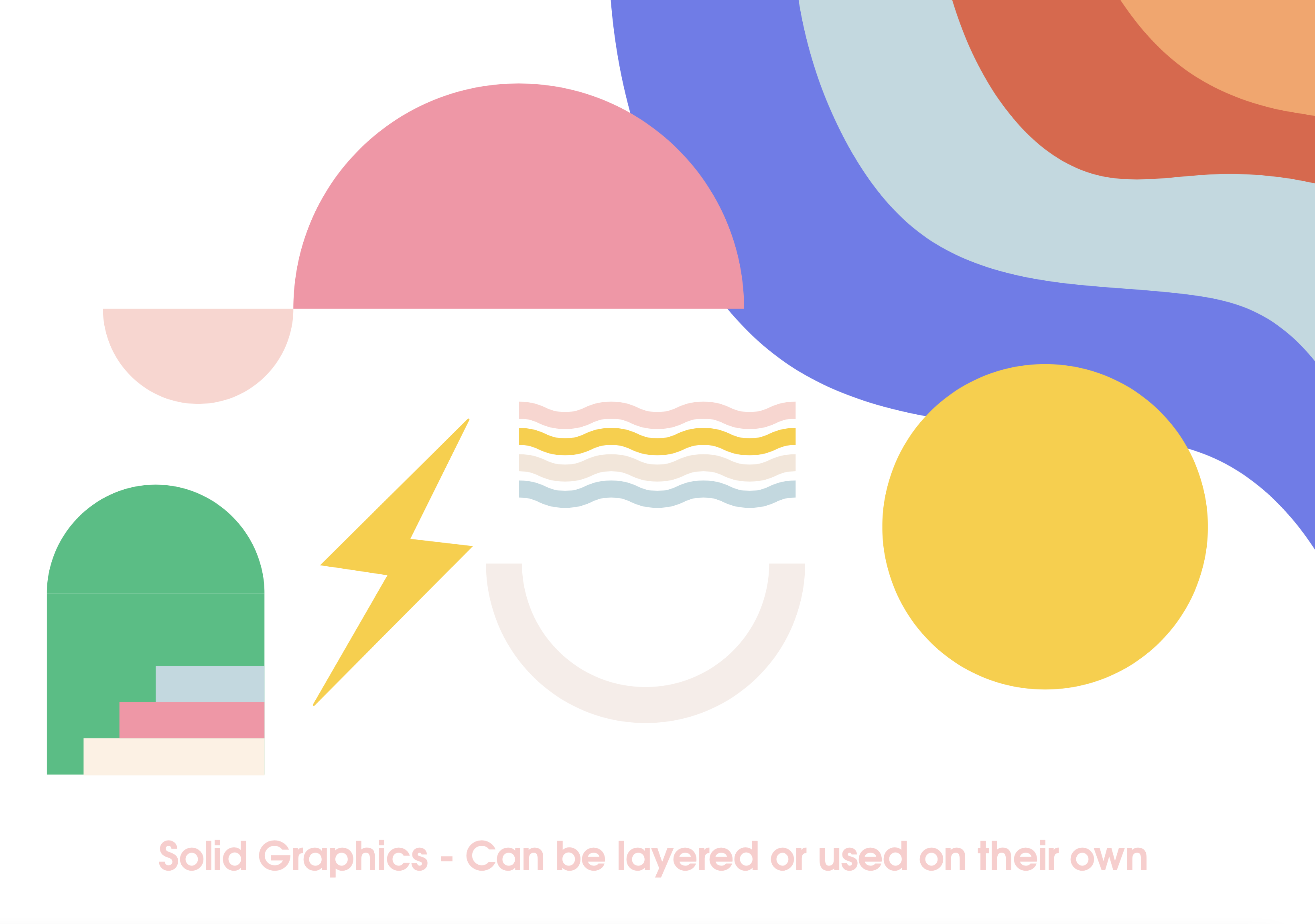
Branding Graphics
Complimentary graphics/icons and/or patterns can be illustrative, abstract, coloured shapes. They are pretty much anything that is a secondary compliment to the brand. I don’t add this willy nilly into my branding identities, these are always very thoughtfully placed and aligned with your purpose.
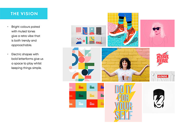
Get Moody! Look and Feel
Moodboard’s for me, are essential. I use them for every single project I create in the initial stages – including my own, because it helps to really narrow down your niche design style into a visual snapshot.
So why does my small business need brand guidelines?
- A guidebook that keeps you on the straight and narrow is like having a secret superpower of consistency and credibility to be the absolute best representation of your brand.
- Branding needs to be thought of as a living breathing person. How would you want that person to connect with people around you? It has a personality (sounds weird, but it’s true) and its very own tone of voice. That tone is your best asset to connecting with people, your people, on an emotional level, to convey your value. The quality of that value and what specifically you have to offer is immediately obvious because you have created it with all of the elements.
- Good branding guidelines will help you stay in your own lane, not dilly dally, tweak your colours or change fonts on a whim. Your brand will remain strong, consistent and clear across all of your marketing and visual collateral – be it business cards, Instagram, Facebook, brochures, quite literally anything! The list really is endless in how you can show up in the digital and printed world.
Your guidelines are handy and super helpful to use reference. You may like to print it out and have it sitting on your desk or somewhere where it is visible so that you can always keep “in-check” when you are working. It saves having to constantly go back to check what your fonts are, what the colour codes are. I also have these saved into my Notes on my iMac as it’s super easy to access or to know the type of images you are going to use.
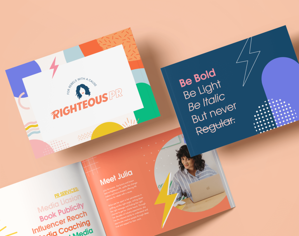
So to sum things up, here are my 5 magical reasons why I believe you need branding guidelines for your business:
- Your branding will be memorable – your customer truly connects with your brand
- Consistency – the look and feel is right every time.
- Efficiency for you – everything in one place from the get go.
- Customer loyalty – the customer trusts you more when they know what to expect.
If you’re just starting out or feeling like a refresh is in your bones, and you’re wondering if it’s time to put some guidelines in place? Well my answer is a hard yes!
It’s never too late to begin reigning in your brand so that it’s cohesive, aligns with your purpose and is easily recognisable to your target audience.
If you found this article helpful, or have any more questions about it – please reach out to me here.
If you need help or want to work with me on your branding – I’d love to have a chat when you’re free.
